Okular has two user interfaces, you can control which one you get when compiling okular by setting the OKULAR_UI cmake variable to desktop (the default) or to mobile (which you can build just fine on the desktop too, there's nothing "mobile only" in it).
The mobile one is built on top of Kirigami and is more oriented to use with touch screens. It also has fewer features, for example, you can't add annotations nor fill forms. I could say it's less likely you need those features on a mobile form factor but that's less and less true as time goes and computing shifts to mobile devices, but that's a story for another day.
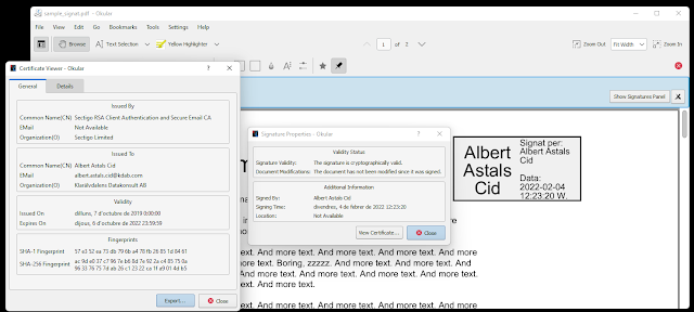
One of the features that was missing until today is the user interface parts related to Digital Signature verification, that is, those parts that say if a PDF is signed, if the signature is valid, let you see the certificate, etc.
Now the same as with the desktop version, you get
the "This document is signed" (and it's variations) banner
The Signature tree on the sidebar/drawer
The Signature properties dialog
And the Certificate properties dialog
The last two are not super great looking but there's not much more you can do when you have to dump lots of data to the user.


